“Safe, Fast, and Reliable”. This was the tagline of LRT 1’s second generation of magnetic tickets in 2003. The ticket series came at a time when then-President Gloria Macapagal Arroyo came up with the term “government of national cooperation” in attempting to get several sectors of society to work together for the common good. This tagline was also used across all of the four designs of the series shown below.
Single Journey Tickets
Unlike in the previous “Go for the Blue!” series, this generation of cards only had two variants for the single-journey tickets (SJT), called “A” and “B” tickets. The SJTs were dominantly colored red.
As was the case with the first generation LRT 1 tickets (and the MRT 2 “Megatren Series”), the former president’s face was also included in the design of this series.


Stored Value Tickets
Likewise, for the stored value tickets (SVT), this series also had two variants, called “1” and “2” SVTs. They were dominantly colored blue.


Ticket Design Flaw
Have you noticed anything with the designs? Look closely!!
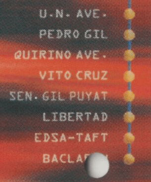
Most of the magnetic tickets had the Baclaran Station name cut off, so only “Bacla” was readable. This was probably an unexpected effect as the layout came in first before they realized they had to allot space for the magnetic ticket hole at the corner.

However — one of them seemed to get it right, with Baclaran being completely readable. One station is missing though: Gil Puyat station is nowhere to be found!!
Reverse side design
All four magnetic tickets had the same design on the reverse side. It contained a promotional material for the Hanjin Heavy Industries and Construction Company. Included was their tagline: “Devoted to the development of Philippine infrastructure since 1973.”
The reverse side also sported the arrowhead that indicates that this is the side facing up when inserting the ticket to enter or exit the station turnstiles. This is in contrast to the MRT 3 magnetic tickets, where the side facing up is the obverse (front) side design.

Conclusion
The Gen 2 “Safe, Fast, and Reliable” ticket series continued the Automated Fare Collection System (AFCS) of the Gloria Era. There were some misprints or flaws in the design, hopefully not missed by keen observers riding the “Yellow Line” in the early 2000s.
Were you able to spot these flaws when you rode the train before?
Hi Think These Needs A Repair
And Also Kindly Add More LRTA “Erap” Ticket Sires& Arroyo Tickets Sires Please